Colour theory & courage
References, palettes and software
I’ll start with a disclaimer, I am completely unqualified in the colour space. My approach is mainly based on instinct.
Nature is truely my greatest reference point for colour. Florals, shells & stones. The sky (a true masterpiece, and different in every moment). One of the most moving colours for me is at dusk, when the blue hue falls on everything and feels at once both grounding and serene. The colour of pine needles. The bark on a gum tree peeling to reveal the pinks underneath. The black volcanic rocks in New Zealand glistening once the saltwater washes over them.
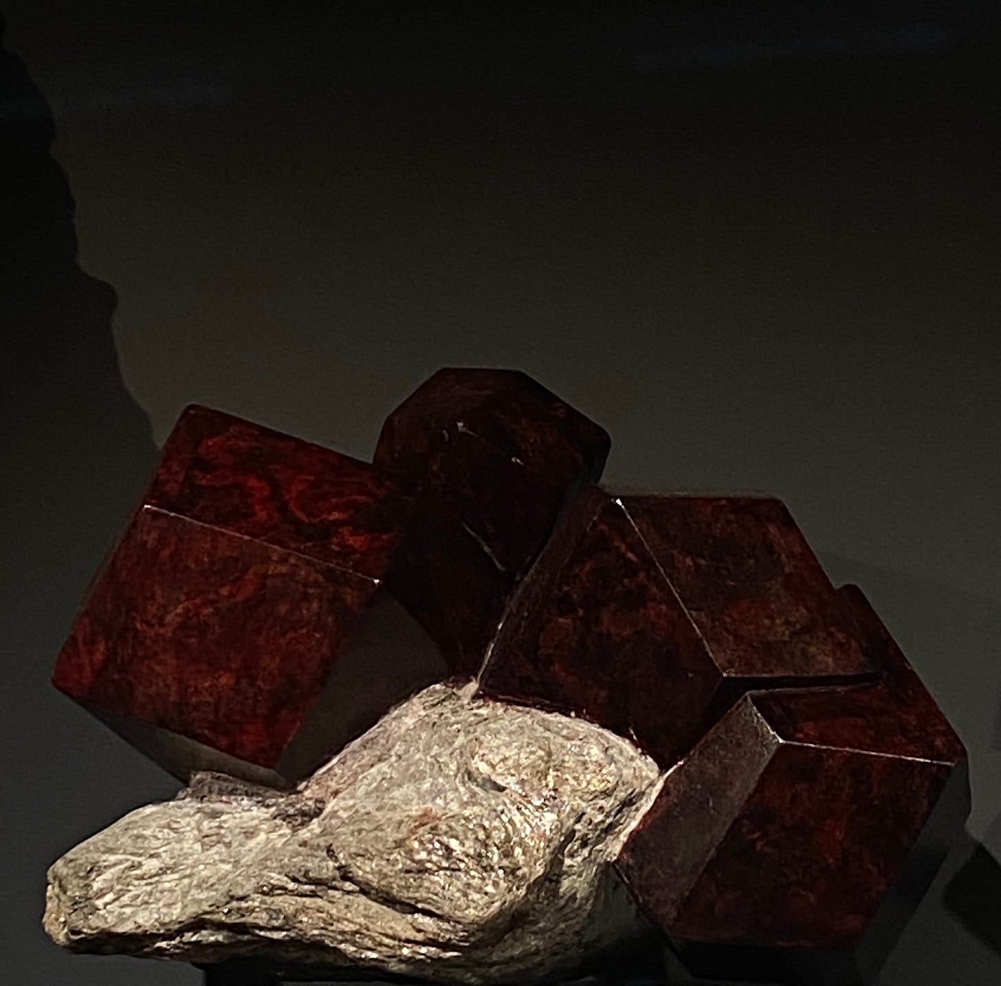
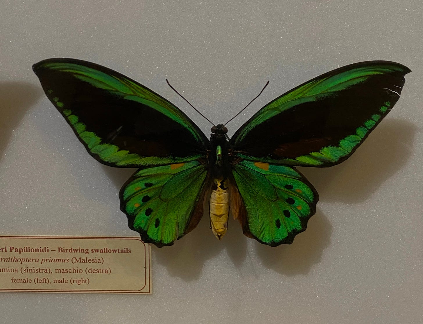
When we visited Florence last year, we were deciding whether to brave ourselves for the long queues of the Uffizi Gallery or not. We decided against it and on a walk, stumbled upon La Specola which is the Museum of Natural History. In my opinion, this is the greatest art. The mineralogy collection in particular left me in complete awe. The collection of bugs & butterflies were truly magnificent. As I sauntered along glass pane after glass pane displaying the exquisite treasures, it renewed my sense of wonder in the natural world. As I look at the images now, what an incredible ode to colour they are.
Not everything needs to be neutral. I think we got really scared of colour? Palettes started homogenising and neutrals became the default. Opting for colour became a somewhat daunting space to step into.
Maybe muted tones have been connected to sophistication and conveying a sense of refinement. Neutrals do often feel more natural as the earthier tones reflect the natural world, however as seen above, bold and varied colours really make up our world. In pondering on this, neutrals may be soothing, grounding, conveying serenity and simplicity, although I’ve found the full variety in different contexts can shift our mood in different ways and bring a lot of beauty (and expand our self-expression).
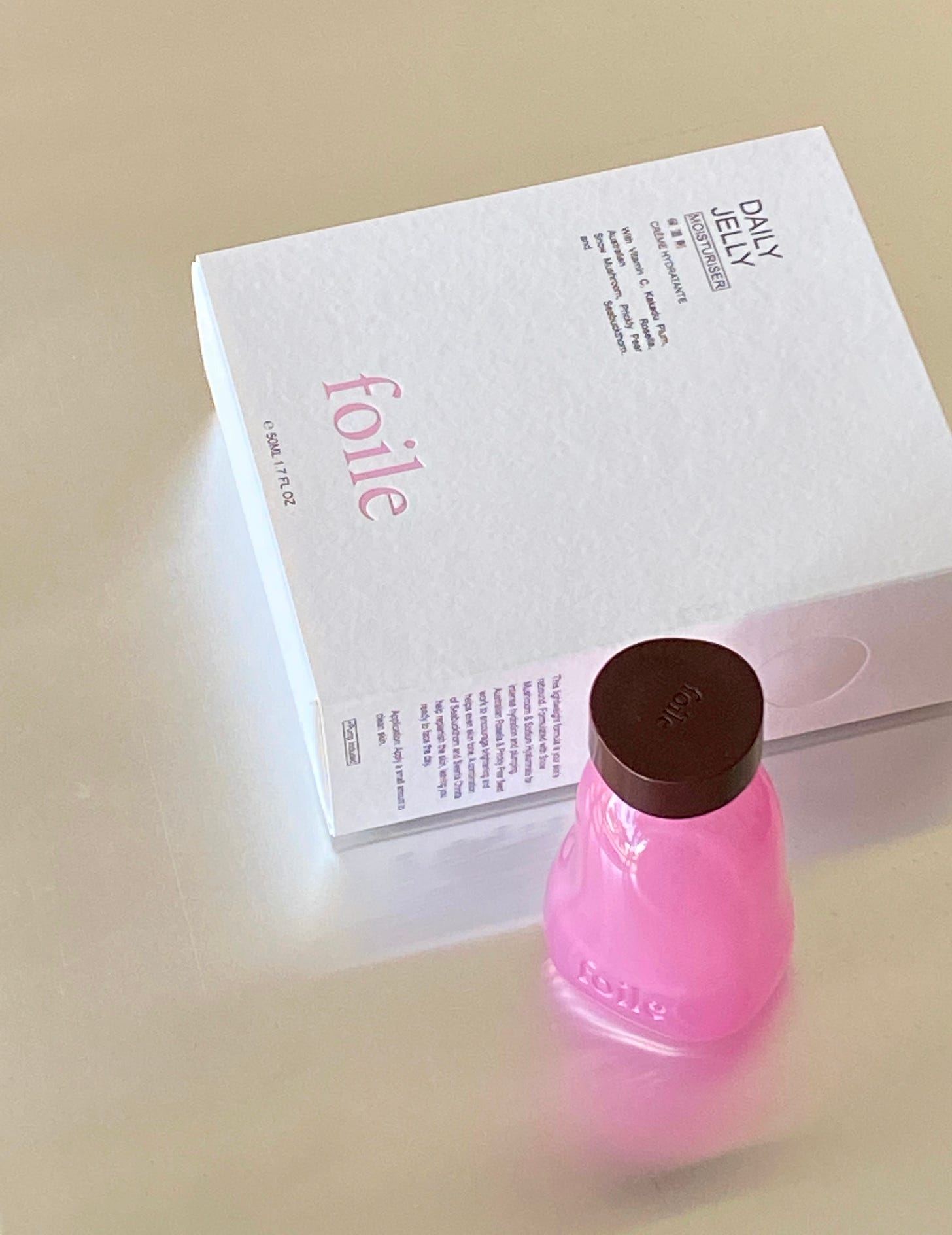
With regard to emotions, when I build our palette of colours for the Foile bottles, they are meant to be joyful and distinctive. Colours can be refreshing, especially when placed in a new context.
I wrote in a recent interview for The Fold:
“It was important to also reflect on, what are we actually trying to communicate with the design beyond aesthetics? I went to the Alessandro Mendini exhibition in Milan last year at Triennale Milano and thought about the iconic designs he had created for Alessi – they were so joyful and fresh, something about it stuck with me. I also think about Missoni, such a distinctive visual identity that has a timeless energy. I guess we want Foile to convey a similar courage.”

The packaging for skincare has to date opted to be white & clean, or amber glass, as this ties back to more pharmaceutical or apothecary roots. My guess is, in maintaining this, it can give the product a certain unspoken integrity by way of association in this visual language.
We however, opted for quite the opposite. Not only a distinctive signature design but paired with seemingly bold colours. I want to say there is an exact science behind this and there probably is, however safe to say that book was never purchased, let alone read, so instead I dare proceed with the courage I hope to convey.
The first input in the process is the type of product or ingredients, which can give me a gentle nudge in the right direction, such as our Milky Emulsion Cleanser being a marshmallow white. Or our Deep Blue C Cream being an almost electric orange (a lot of vitamin c skincare packaging is also orange so nothing revolutionary happening here).
The second input is often nature – I saw a Kangaroo Paw flower (which is an ingredient in one of the formulas) which was an extraordinary mix of deep purple and teal and I just thought, how cool? Teal kind of left the zeitgeist which it felt refreshing to be reintroduced.
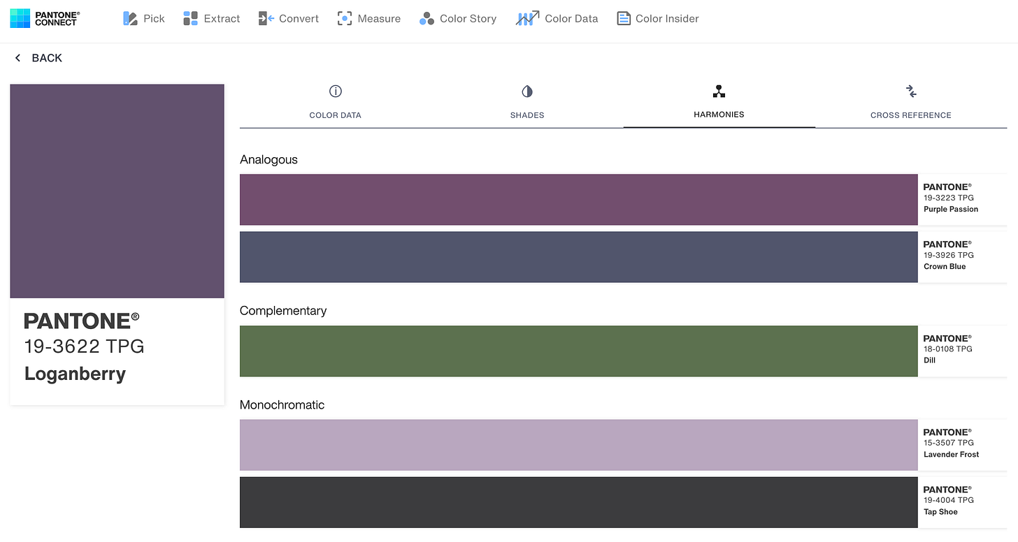
I then take these hues or initial idea and turn to Pantone Connect to continue the discovery process. Noting, it is sadly not a free service and I have a premium subscription to this. Basically, it has the entire Pantone library to search and discover. The Pantone Connect tool lets you build palettes in a simple way. You can click on a colour to see other shades, complimentary colours etc. Selecting the bottle colours is actually generally easy. I might have a sense in mind (from input 1 & 2) and then click through until I land on a colour I feel drawn to. I think there are tones of colours I just instinctively connect to and ones I don’t. As you build the palette, you can see the selecting colours sitting next to each other. As we have a lot of bold colours in the range, it is important to see how they sit together. I might have selected a new colour but the tone is slightly too cool or too warm next to the others (once you have them lined up it is easier to determine whether it is jarring) – again, this is more based on instinct as to what feels harmonious.
I don’t often consult anyone for feedback on colour (other than Su of course) as it is kind of an area we keep from outside input, otherwise I think we could easily be swayed out of any and every colour. This is where the courage comes in!
I will consider a colour to the extent that feels practical, without however falling into too much second-guessing otherwise I’ll get myself in a tangle.
Once we feel connected to the palette, we just move ahead into sampling. This is a crucial step as it means moving a colour from a digital representation to a physical material, which can adjust the application and tone significantly. In a previous sampling round, upon receiving the bottles I would run around taking photos of the bottle next to objects of different colours to gage the tone for the matching lid.
Without diving in to discussing materials in depth, they do matter a lot in the context of colour. For the Foile range, the bottles are glass with a reflective nature that picks up the light. If you are painting an interior wall, the difference between a matte finish paint vs high gloss is going to change the way the colour interacts with light. A certain colour might feel unnatural as a wall colour, but work as a wool sweater? Colours can often stay in my orbit until they find a landing pad and that is sometimes just about finding the right context for it.
A close friend and I have been discussing this a lot lately – dressing in colour. I feel in recent years I’ve really reentered the colour spectrum and, although there are no rules, a little discernment has helped. By this I mean, paying attention to not only how a colour feels (very important) but also the context it is in, the material, the application. And, when paired with a bit of courage, I now feel I have a much wider sense of self expression as a result.
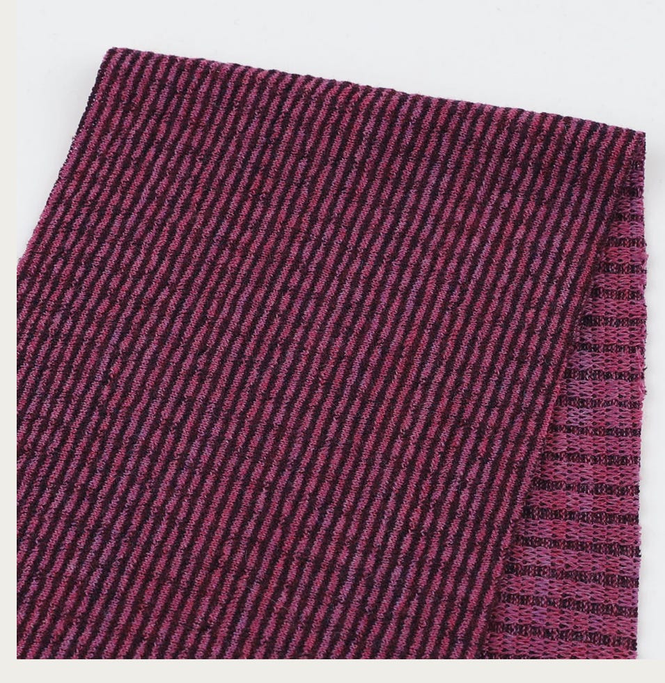
And the conversation tends to come back to the importance of colours that suit you. I bought a mauve skirt, vintage Agnes B from Mori Market, last year which I love!! In the past I would never have worn pinks or purples but it is really just about the tone (and the courage to wear it). After working out I’m a ‘soft autumn’, I felt emboldened to continue with other tones, like a teal, the pewter greys etc. The mauve continues as I recently fell in love with a merino textile online at The Fabric Store which was sadly only sent to stores, so on a trip to Melbourne a couple of weeks I went to the store to find it. After being put on a second hold overnight, I managed to purchase some of the fabric and I’m yet to decide what I will make, knowing I do have two upcoming weddings which I need an outfit for.
This expansion of colour has continued in our house when I found a blue rug for the living space. We needed a rug and why not put the colour on the floor? (I really loved painted floors or pigmented earthen floors). We also had a bright orange puffer fish Japanese lantern I purchased at CIBI which really brought a sense of joy to the space. This was the second installment after the initial lantern I purchased at the Noguchi Museum in New York a few years ago – I love them!
I also don’t tend to find myself drawn to beiges, unless it is in a natural material form i.e. timber. The tone variations in timbers alone are astounding. I remember building a bench seat from some incredible hardwood offcuts which had originally been painted, and the moment when you first sand back the outer layer to reveal the rich colour underneath is a true joy!
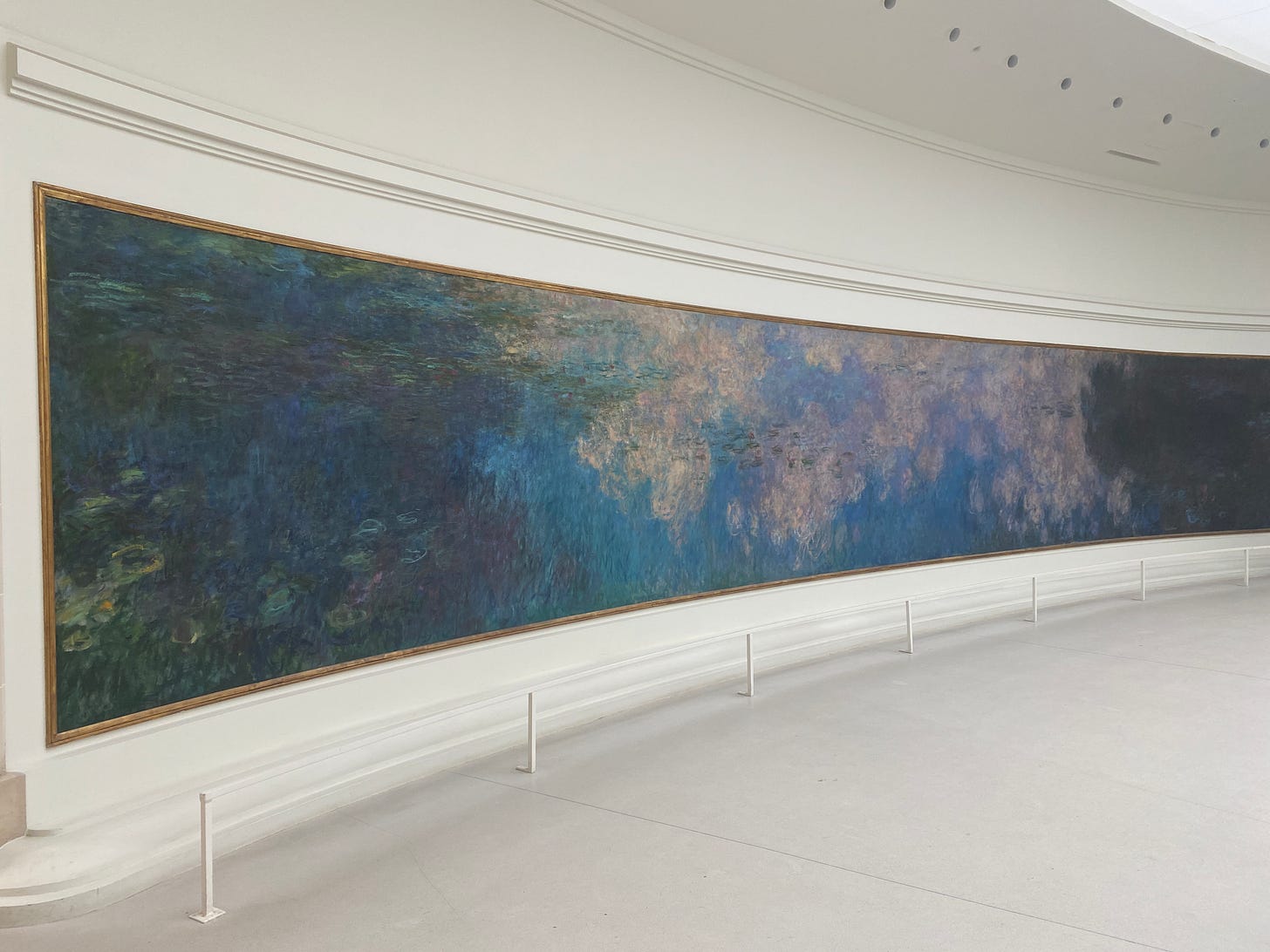
I started writing about colour in architecture and natural materials but I’ll save that for another post. I’ll leave you with Monet’s watercolours I visited in Paris one year and I feel the beauty of these colours was palpable, you want to just sit in quiet contemplation for hours in the seating they provide in the centre.
– Alexandra





Loved reading this! I'm off to dress in pink immediately